

Branding and Identity
Visual Personality: A Strategic Approach to Type and Colour
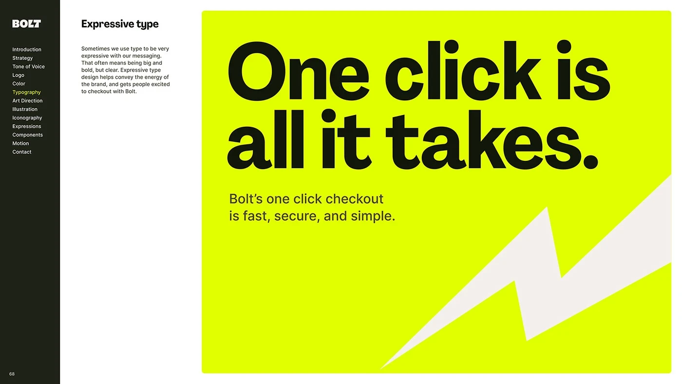

Moving Beyond Subjective Design Decisions
When we talk about visual personality, we are talking about the consistency of signals a brand sends. A common mistake in the early stages of a business is picking colours based on what the founder likes or choosing a typeface because it looks 'modern.' While these choices aren't inherently wrong, they are often disconnected from the brand's core mission.
To build a defensible identity, you must map your brand values to specific visual attributes. If your brand stands for stability and trust, your type choices should reflect classic, legible proportions rather than erratic, decorative letterforms. If your brand is about disruption and energy, your colour palette should prioritize high-contrast, bold combinations over muted, neutral tones. The shift here is from aesthetic decoration to intentional communication. By treating design as an extension of your business plan, you ensure that every visual touchpoint reinforces your value proposition.
The Strategic Role of Typography
Typography is the primary voice of your brand. When a user lands on your website or reads a brochure, the typeface they encounter sets the rhythm for the entire interaction. A geometric sans-serif typeface often feels contemporary and transparent, while a well-crafted serif can evoke authority, heritage, and sophistication.
Consider an example: A financial advisory firm needs to communicate security and longevity. Using a highly stylized, experimental typeface would create visual friction, making the audience subconsciously question the brand's seriousness. Instead, opting for a typeface with a stable x-height and clear, open counters builds immediate confidence. Your typeface is the medium through which your message is delivered; ensure the medium doesn't contradict the message. When selecting type, consider the 'personality' of the letterforms—do they suggest openness, precision, or perhaps human warmth? These qualities are often felt long before the actual words are decoded.
Colour as a Tool for Recognition
Colour is often the first thing the human brain processes in a visual identity. It has the ability to trigger emotional associations and assist in rapid identification. However, the trap many businesses fall into is selecting a palette that is either too broad—losing all impact—or too derivative of industry competitors, making them invisible.
Strategic colour selection requires a hierarchy. You need a primary colour that does the heavy lifting for recognition, and a secondary system that allows for variation across different media, such as print, digital interfaces, and packaging. When choosing your colours, ask yourself if the palette distinguishes your brand from the 'sea of sameness' in your specific category. If every competitor in your space uses blue, a strategic pivot toward a warm, earth-toned palette can command immediate attention. A limited, disciplined palette is always more effective than an expansive, chaotic one, as it makes your brand easier to recall and simpler to implement across diverse marketing materials.
Establishing Design Governance
To scale effectively, your visual personality must be replicable. Founders often struggle with consistency once they begin delegating design tasks. This is where a formal set of guidelines becomes essential. Governance isn't about stifling creativity; it is about providing a roadmap so that whoever interacts with your brand assets can maintain the integrity of the original strategy. By documenting your rules for type scaling, colour ratios, and whitespace, you ensure that your brand stays unified even as your marketing team expands or your project scope grows. Think of these guidelines as the 'guardrails' that allow you to innovate within your identity without straying into confusing territory.
A Framework for Visual Cohesion
To ensure your visual personality remains intact as your business grows, you need a set of constraints. Use this checklist to audit your current brand assets periodically to ensure they still serve your overarching objectives:
The Tone Match: Do your fonts and colours accurately represent your brand's core promise? (e.g., Is the tone 'approachable' but the design 'cold'?)
Category Context: Does your palette differentiate you from your top three competitors while remaining appropriate for your industry?
Functional Hierarchy: Is there a clear primary typeface for headlines and a secondary, high-readability typeface for long-form body text?
Media Versatility: Do your chosen colours retain their identity across both backlit digital screens and physical print substrates?
Constraint Audit: Do you have more than three primary brand colours? If so, are they necessary, or are they causing visual clutter?
Legibility Check: Are your font pairings readable at small sizes (like on mobile screens) and large sizes (like on signage)?
The Cumulative Impact of Intentionality
Consistency breeds trust. When a potential client sees your email signature, then visits your website, and finally holds your physical business card, the experience should feel like a single conversation with one personality. This sense of familiarity is what builds brand equity over time. When design is treated as a strategic tool rather than an afterthought, you stop merely existing in the market and start building a recognizable, professional presence. Your visual system should not be reinvented every year; instead, it should be a robust foundation that gains more recognition the longer you stick to it.
Conclusion: Building for the Long Term
A visual personality is not a static state; it is an evolving system that supports your business growth. By grounding your typography and colour choices in clear strategy, you create a brand that feels authoritative and intentional. Every touchpoint—from your invoices to your social media graphics—becomes an opportunity to reinforce your market position. When design is treated as a strategic tool rather than an afterthought, you move beyond mere decoration into the realm of true business asset development. Commit to your visual system, refine it, and allow it the time it needs to embed itself into your audience's memory.
Need a thoughtful brand identity? Get in touch with Shabeeb Maloof.

