

Branding and Identity
Beyond the Palette: Building a Flexible Visual Identity System
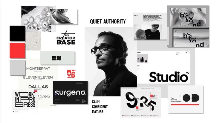

The Limitation of Static Brand Guidelines
Traditional brand guidelines were designed for an era where a brand appeared in predictable formats: business cards, brochures, and storefront signs. Today, the environments where a brand lives are infinite. If your guidelines explicitly state that a logo must always be centered or that a specific blue must be used in a particular proportion, you are likely creating bottlenecks for your internal teams.
Rigidity forces designers to choose between following a rule that doesn't fit the context or breaking the rule entirely. When team members are forced to break rules, they lose the ability to maintain the brand’s integrity. A flexible system, by contrast, provides a logic for how to adapt components while staying true to the brand’s visual DNA.
Moving from Static Assets to Modular Components
To build a system that scales, you must stop thinking of your identity as a fixed image and start viewing it as a collection of modular assets. Think of your visual identity system as a set of building blocks. A fixed asset is a souvenir; a modular component is a tool.
For example, if you have a set of abstract shapes or a specific grid pattern that defines your brand’s personality, these should be assets that can be scaled, cropped, or combined in various ways. By creating a library of these components, you give your team the freedom to create new content that feels native to the platform—whether that is a LinkedIn banner, a dense technical document, or an outdoor billboard.
The Logic of Systematic Adaptation
Flexibility does not mean inconsistency. A well-designed system includes ‘logic parameters’ that define how components interact. These parameters are the guardrails that prevent the brand from becoming chaotic. Without logic, a system is just a collection of parts; with logic, it becomes a language.
Consider a hypothetical software company. Instead of dictating a single color palette, their system might define a primary set of colors for high-level communication and a secondary set of functional colors for product interfaces. The logic dictates that functional colors should never overshadow the primary identity. This type of strategic thinking allows for visual variety while ensuring the brand remains instantly recognizable. It treats the brand as an ecosystem that adapts to the environment it occupies.
Establishing Hierarchies and Relationships
One of the most common mistakes in branding is treating every visual element as equally important. In a flexible system, you must define the hierarchy. Your logo, typography, and imagery do not occupy the same space in the same way across all media.
When scaling, you need a system that knows what to dial up and what to pull back. On a small screen, the logo might need breathing room, while the typography becomes the primary carrier of brand personality. On a large-format display, the imagery might take center stage. By defining these relationships in advance, you allow your team to make design decisions that prioritize the goals of the specific medium rather than slavishly following an arbitrary set of dimensions.
Framework: The Three Layers of a Scalable Identity
To ensure your visual identity system can handle growth, evaluate it against these three layers:
The Core (Unchanging): Elements like the logo, wordmark, and fundamental brand values. These provide the anchor for your audience. These should remain consistent to build long-term recognition.
The Structural (Adaptive): The grid systems, typography hierarchy, and spacing rules. These are the rules that allow for consistent information architecture across different media formats.
The Expressive (Flexible): Illustration styles, photography treatments, and motion assets. These are the elements that can shift based on the specific context of a campaign, a product launch, or a demographic pivot. This layer is designed to be refreshed without disrupting the Core.
Prioritizing Scalability in Execution
When reviewing your visual identity, ask yourself: ‘Does this system account for how we will look two years from now?’ If your current setup requires you to hire an agency every time you need to design a new landing page because the rules are too restrictive, your system is failing.
Good design strategy solves problems before they arise. By building in scalability from the start, you reduce the operational friction that comes with rapid growth. Focus on creating a system that empowers your team to make decisions that align with the brand, rather than one that requires a constant gatekeeper. An empowered team is a brand's greatest asset, and a well-built system is what allows that empowerment to happen safely.
Avoiding Over-Design
There is a common tendency to add more—more colors, more fonts, more shapes—in an attempt to make a brand feel ‘modern.’ However, the best systems are often the simplest. Over-designed identities are difficult to maintain and even harder to scale. If your system requires a complex manual or specialized training to use, it is likely too rigid or too complicated to be effective. Aim for a system that is intuitive enough for a new team member to grasp within an hour of review. The best systems feel like common sense, not like a test of adherence.
Conclusion
A visual identity system is a living component of your business strategy. It should evolve as your brand finds new ways to connect with its audience, providing enough structure to remain recognizable and enough flexibility to remain relevant. By focusing on modularity and clear logic rather than static constraints, you create a brand that is equipped for the long term. This strategy builds resilience into your visual presence, ensuring that your brand stays strong regardless of the challenges or opportunities that come your way.
Need a thoughtful brand identity? Get in touch with Shabeeb Maloof.

